
POPSO
EMPOWERING FINANCIAL FREEDOM
(Intro)
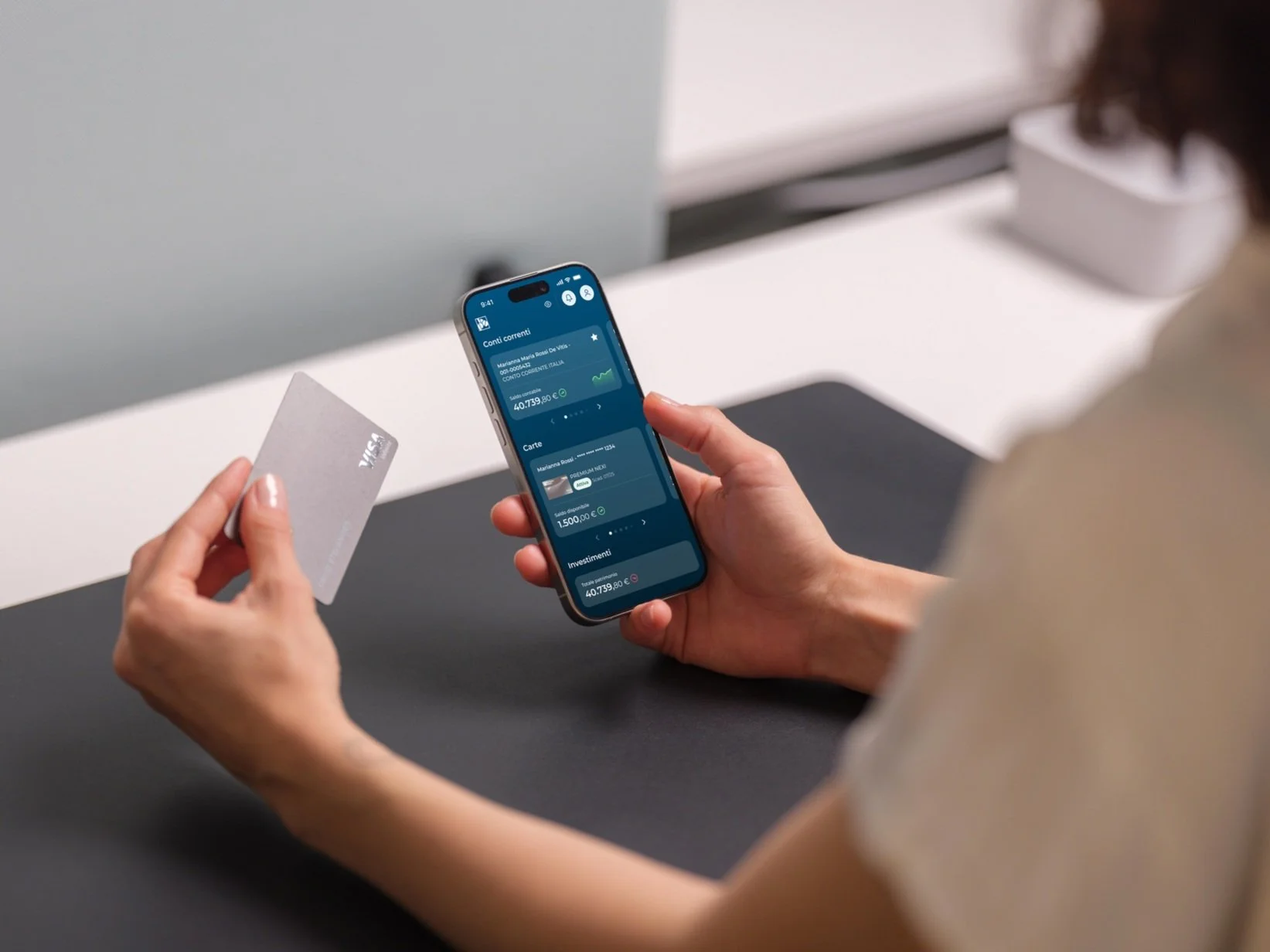
A seamless, secure, and intuitive user experience that allow customers to manage their finances efficiently while reflecting the trust of PopSo.
Banca Popolare di Sondrio is an italian bank that aimed to enhance its digital ecosystem starting from the mobile banking experience to better serve customers.The collaboration started with an assessment of the current online banking and digital touchpoints and it rapidly scaled to the whole redesign of the online mobile banking application.
The redesigned application received positive feedback from both business and users, who appreciated the improved usability and modern look. Key metrics such as user engagement and satisfaction saw significant improvements. The project not only revitalized the digital presence of Banca Popolare di Sondrio but also set a new standard for user experience in the banking sector.
(Client)
BANCA POPOLARE DI SONDRIO
(Touchpoint)
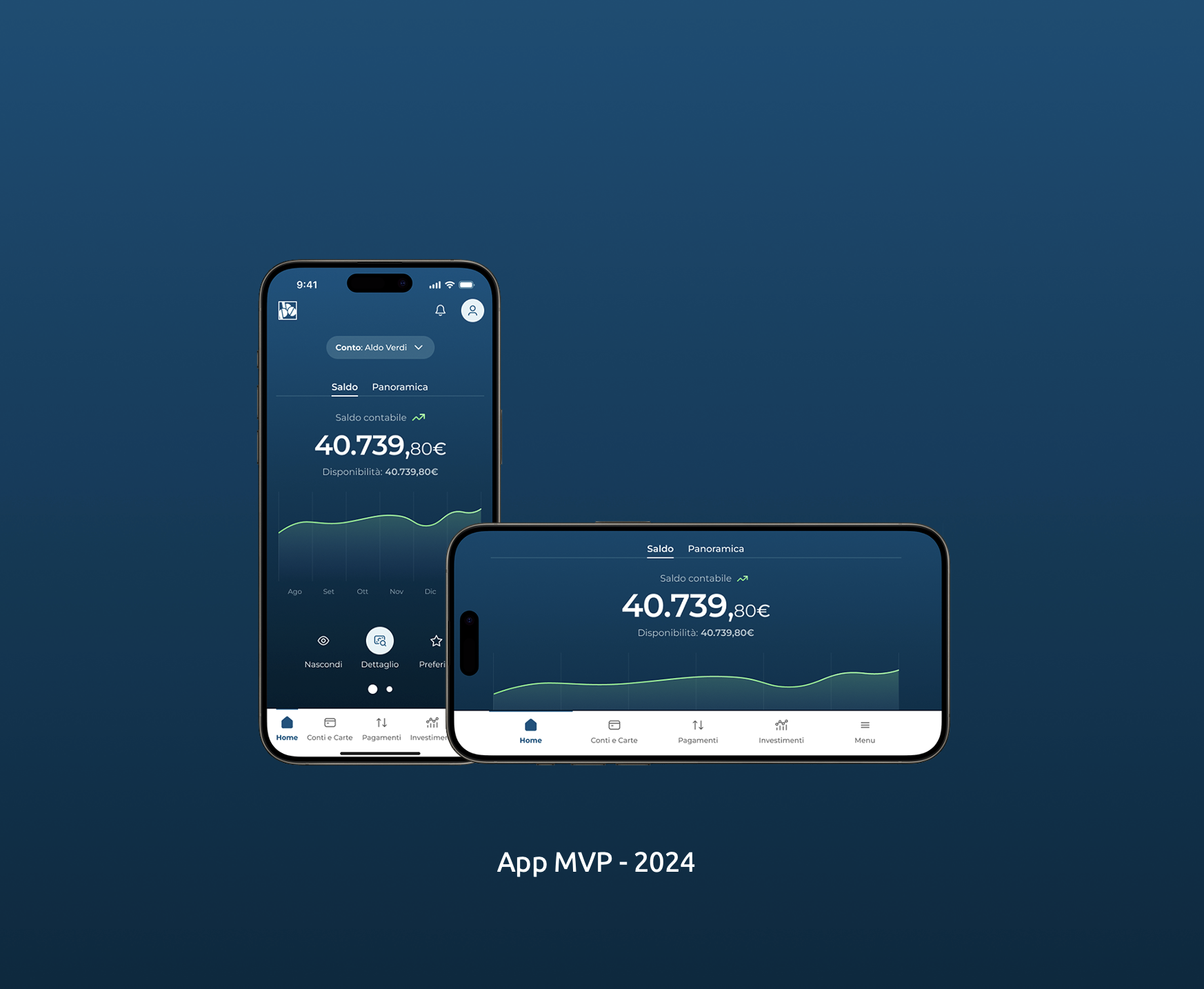
APP
(Timeline)
14 MONTHS
PROCESS
From the digital touchpoints assessment of the existing product to the development of the first realease of the SCRIGNObps app.
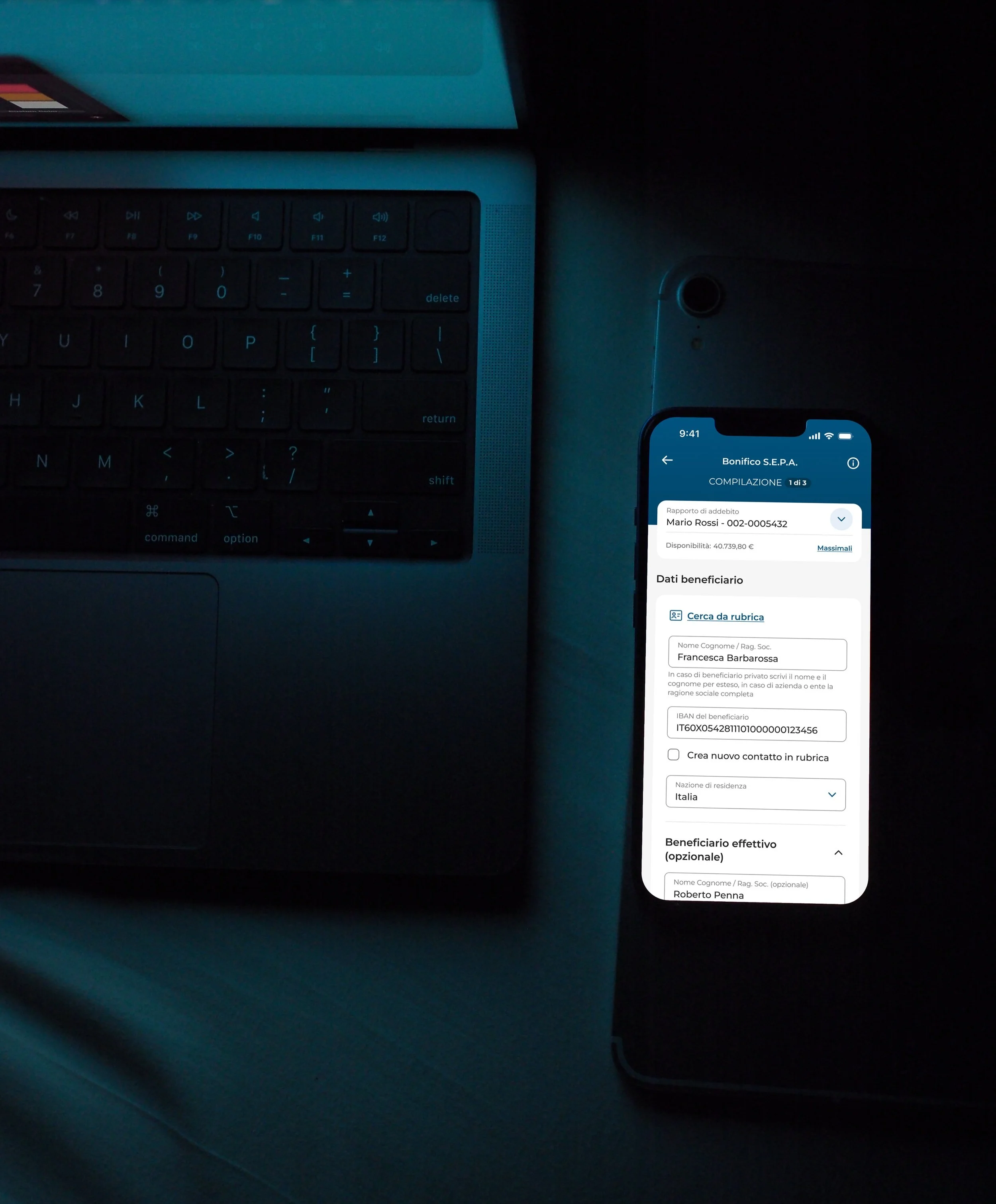
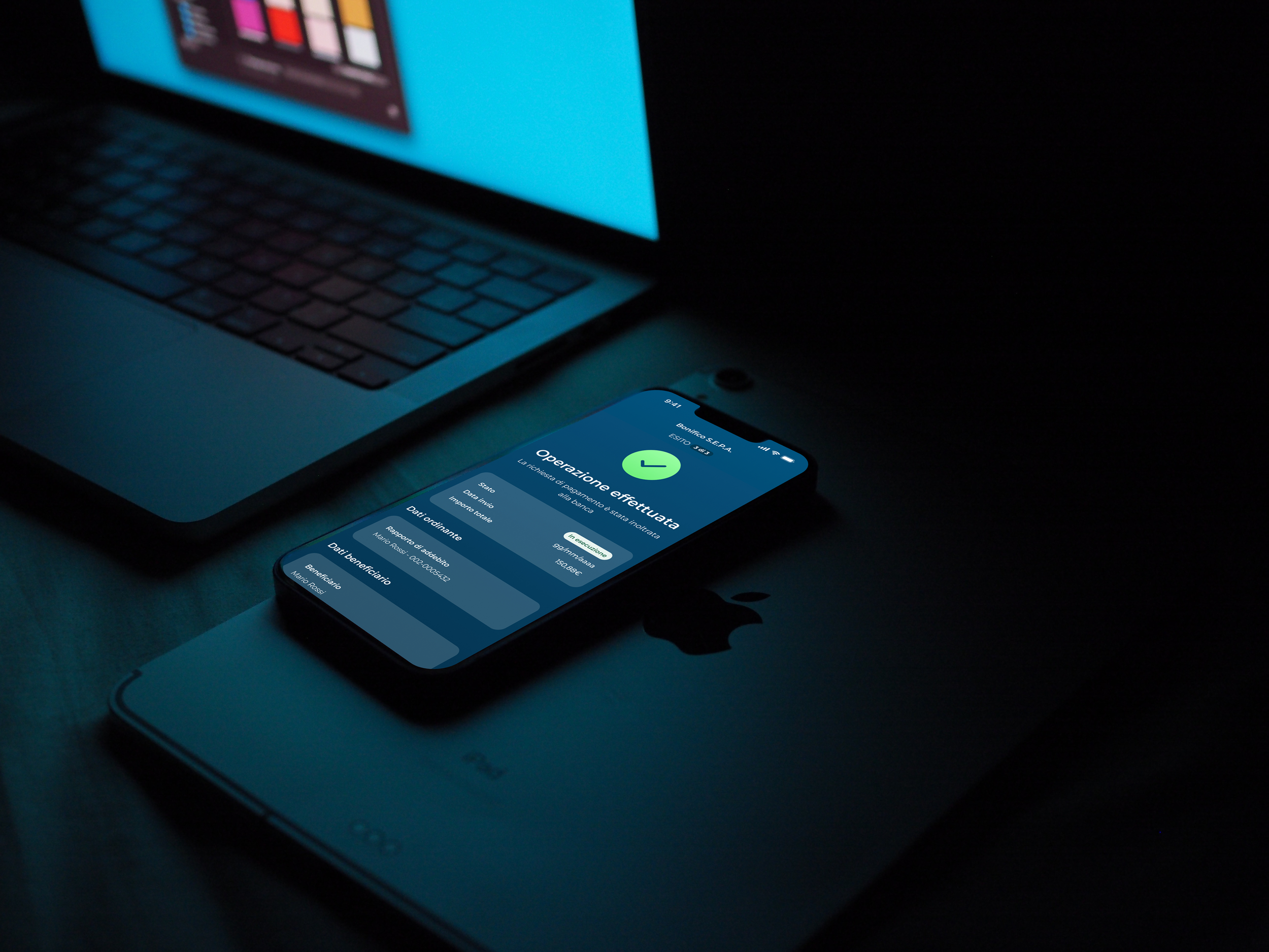
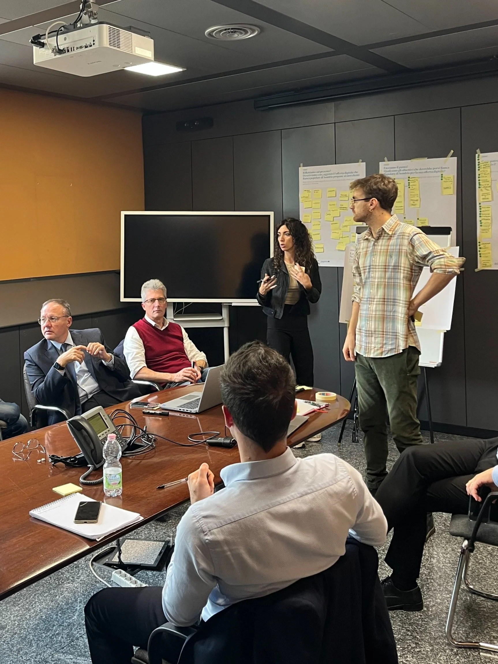
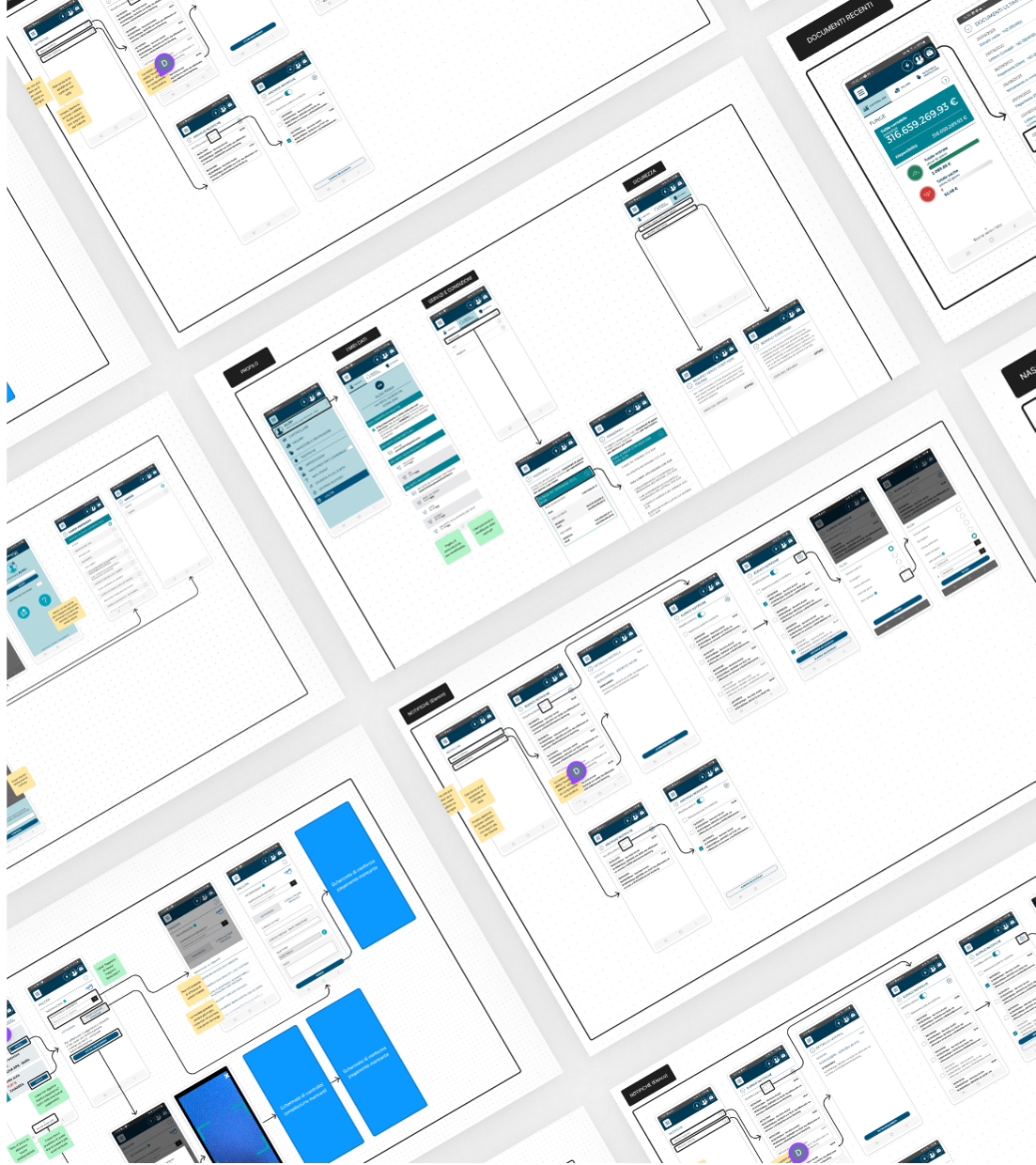
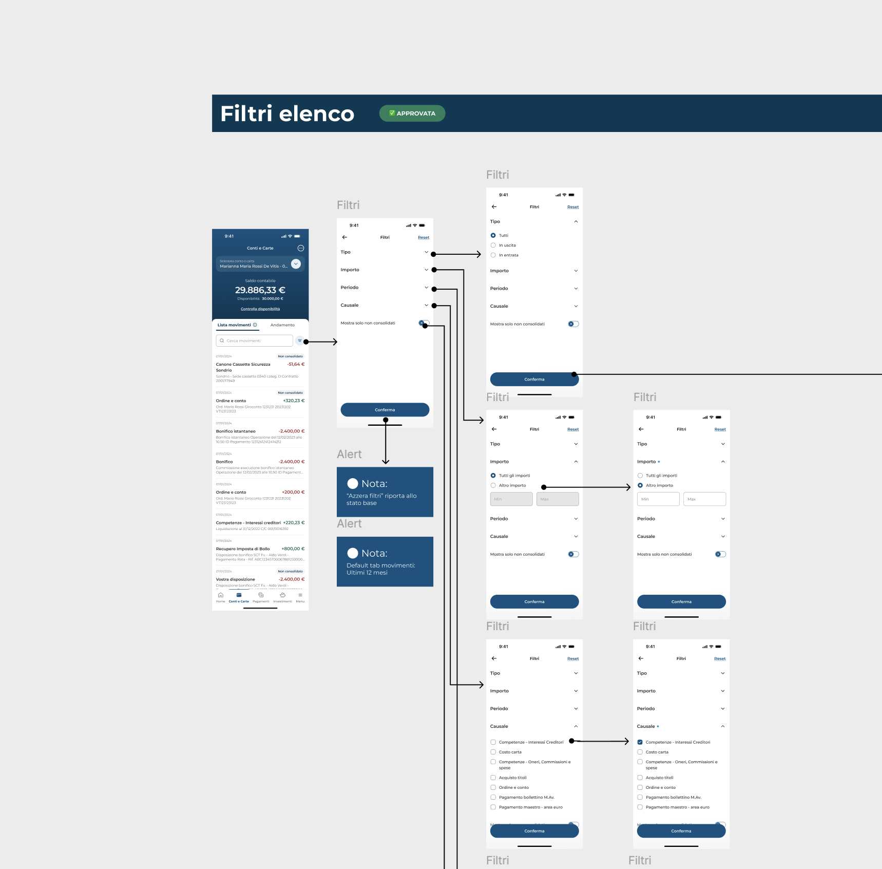
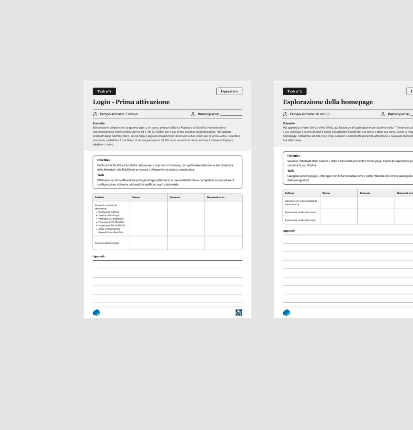
The comprehensive user research initiative included interviews and stakeholder workshops to gather valuable insights. This research informed the redesign of user flows and the overall UX for both existing and new banking features. Through iterative usability testing, the design was refined to ensure a seamless user experience. Each iteration was meticulously aligned with Banca Popolare di Sondrio’s brand values, emphasizing ease of use, security, and accessibility. This rigorous process was instrumental in developing a user-friendly application that significantly enhanced customer satisfaction and streamlined financial tasks.
solution
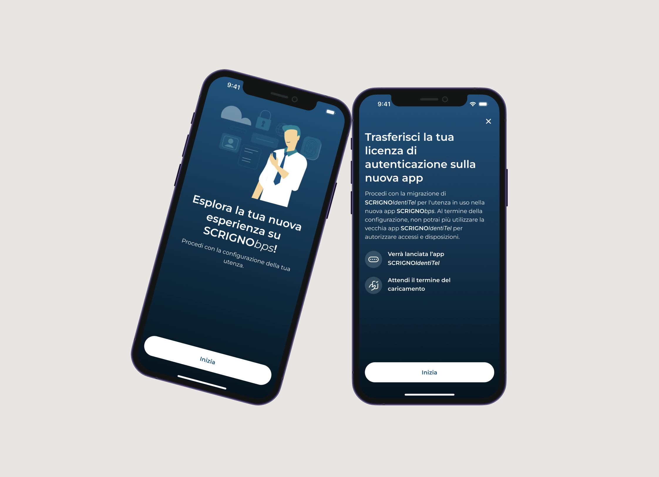
digital security
A strong emphasis was placed on security throughout the design process. The final design incorporated robust security features, providing users with a safe and secure environment for their financial transactions.

User Satisfaction and Engagement
By focusing on user-centric solutions, the application effectively addressed the needs of Banca Popolare di Sondrio’s diverse user base. This approach resulted in increased user satisfaction and engagement, making the digital banking experience more enjoyable and efficient.
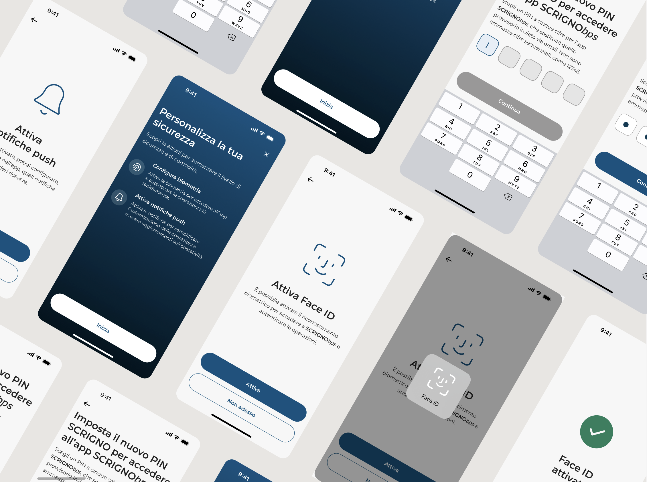
Intuitive design
The end-to-end UX process was led from initial research and persona creation to wireframing, prototyping, and usability testing. Pivotal contributions translated complex financial processes into an intuitive mobile experience, ensuring users could navigate the application effortlessly.
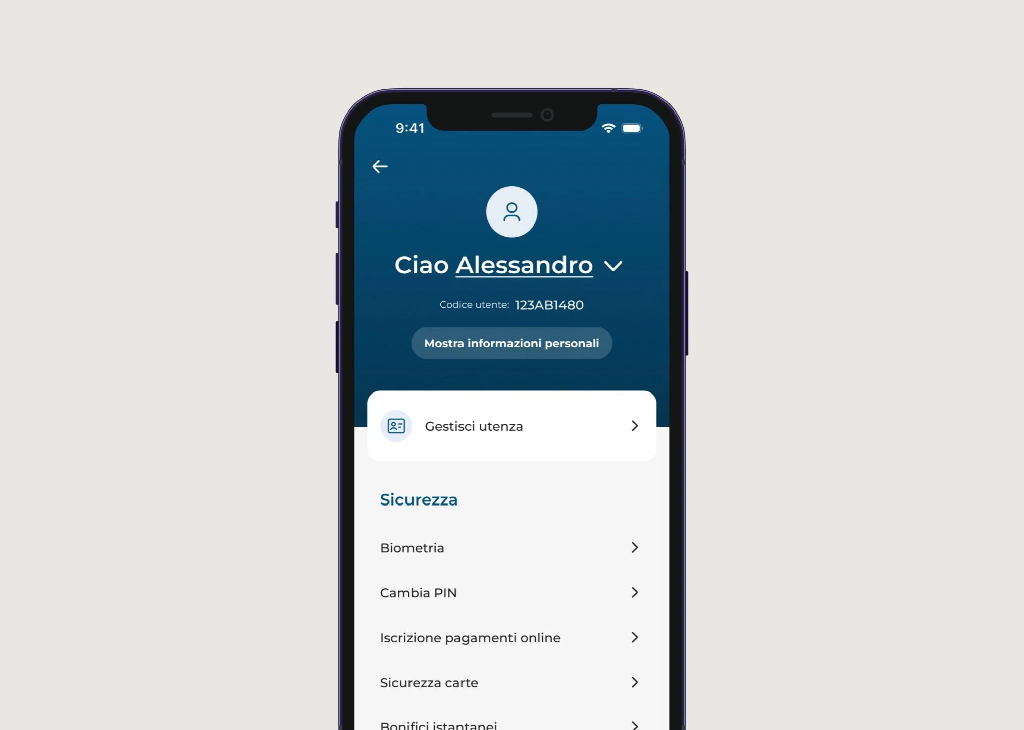
usability & accessibility
High standards of usability and accessibility were met, ensuring the application was user-friendly for all, including those with disabilities. Features such as screen reader compatibility and scalable text were implemented to enhance accessibility.