
WEGLAD
inclusive tool For accessible cities
(Intro)
Starting with the app's core features—map and community—the design prioritized accessibility and ergonomics. The entire user experience was crafted to effortlessly guide users in reporting and forecasting their city routes, ensuring ease of use and enhancing overall functionality.
WeGlad is an innovative startup that aims to create an open source app to report architectural barriers, obstacles and to indicate the accessibility of places in cities, in order to make movements easier for people with disabilities, but helpful for everyon.
By adopting a user-centered approach, the project aimed to improve the onboarding process and streamline the flow for reporting places and obstacles. Through collaborative workshops with real users, valuable insights were gathered to inform the design, resulting in a modern, intuitive, and engaging application that aligns with the new branding and effectively meets user needs.
(Client)
WEGLAD
(Touchpoint)
APP
(Timeline)
4 MONTHS
PROCESS
Collaborating with the community to design an accessible and comfortable tool for everyone.
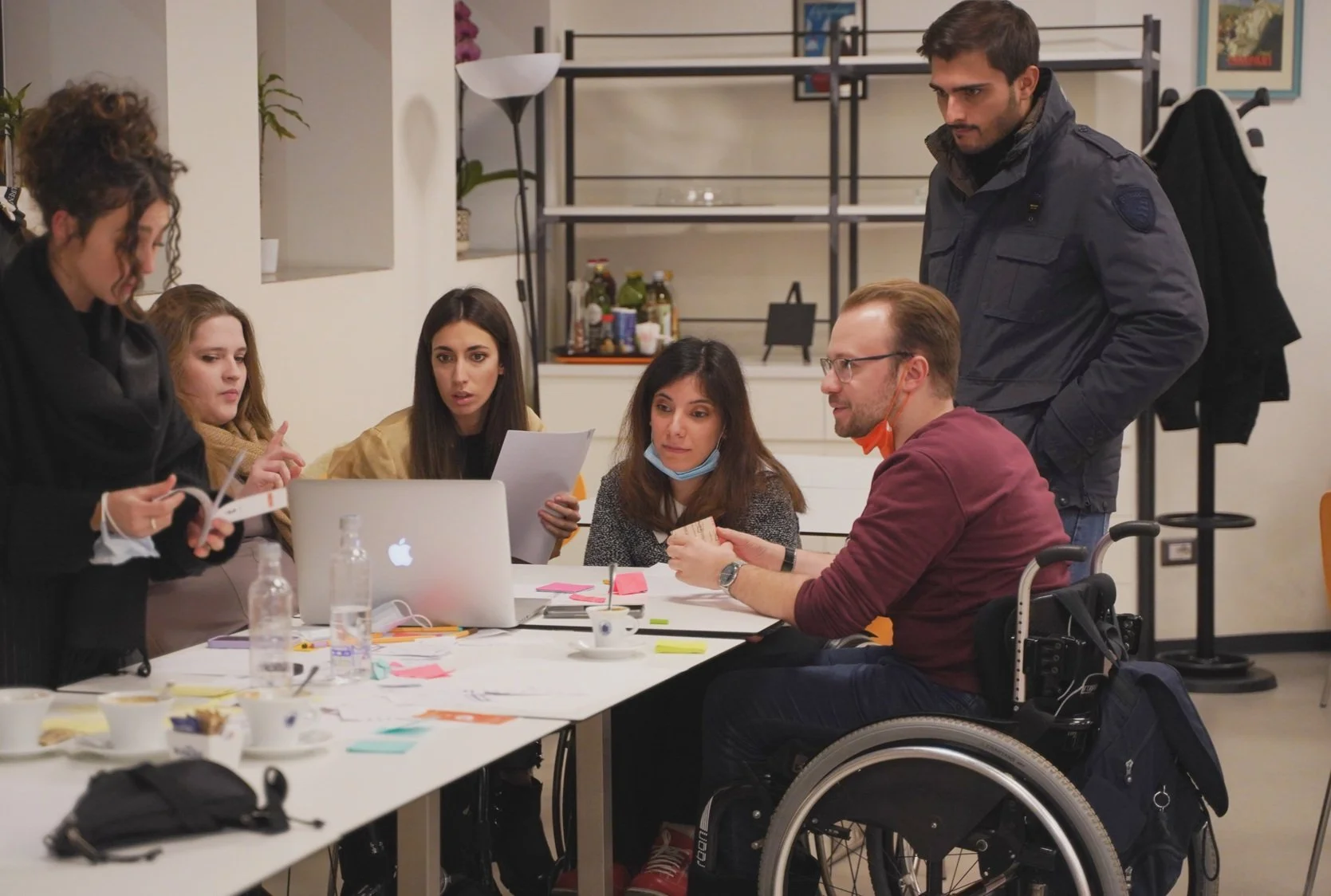
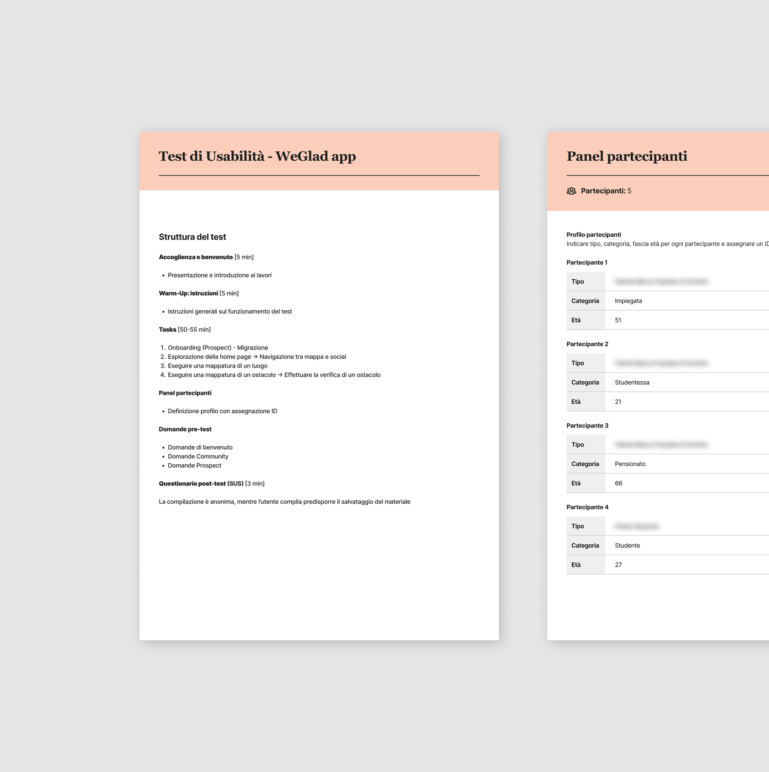
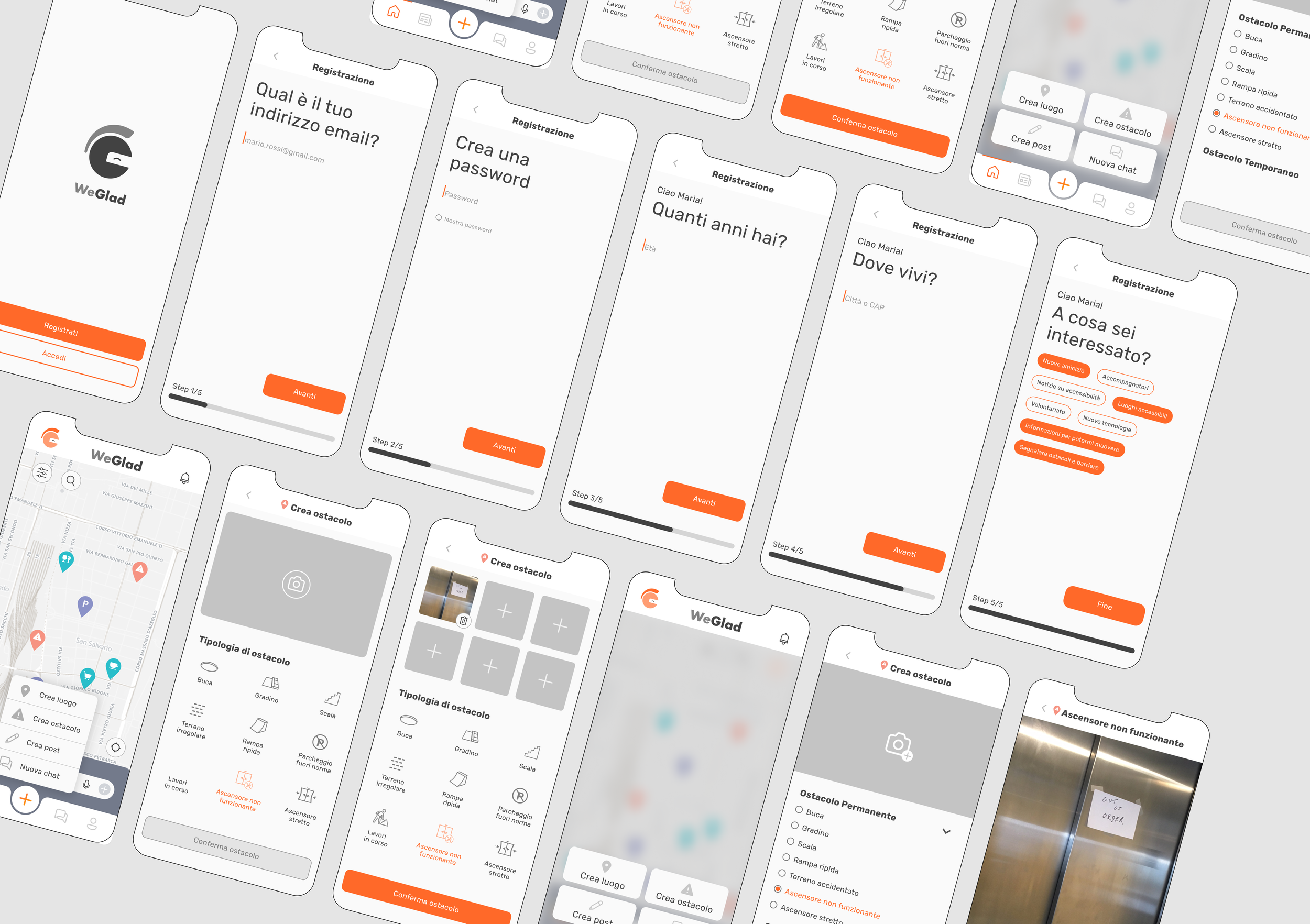
The redesign of the WeGlad app was driven by a user-centered and co-creative approach, focusing on enhancing the core functionalities of the homepage, which includes the map view and the social feed of the user community. Special attention was given to improving the onboarding process and the flow for reporting places and obstacles. The UX wireframe design and navigation between screens were meticulously crafted, to ensure the effectiveness of the user-flow design. A participatory workshop was organized and moderated with members of the community to validate and discuss the new features of the app. This collaborative effort provided valuable insights that informed the iterative design process.
solution
tailored onboarding and intuitive homepage
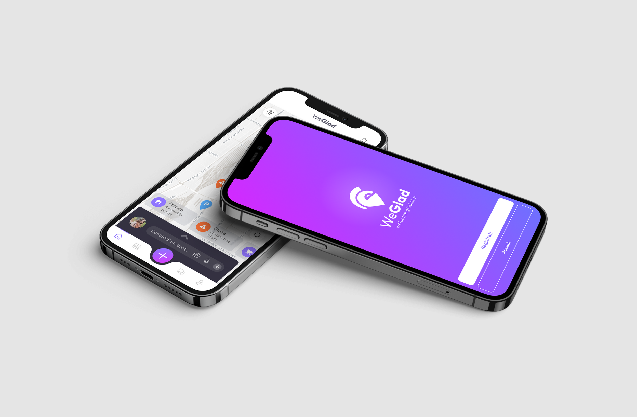
Significant improvements were made to the onboarding process to ensure a smooth and welcoming experience for new users. The streamlined onboarding flow helps users quickly understand and engage with the app's core features.
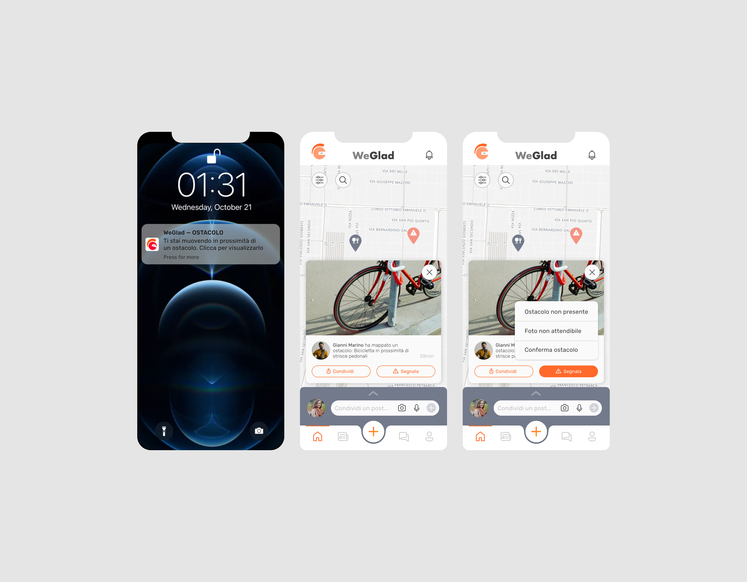
The homepage was redesigned to prominently feature the map view and social feed, which are central to the WeGlad user experience. This redesign aimed to create a more intuitive and engaging interface for users.
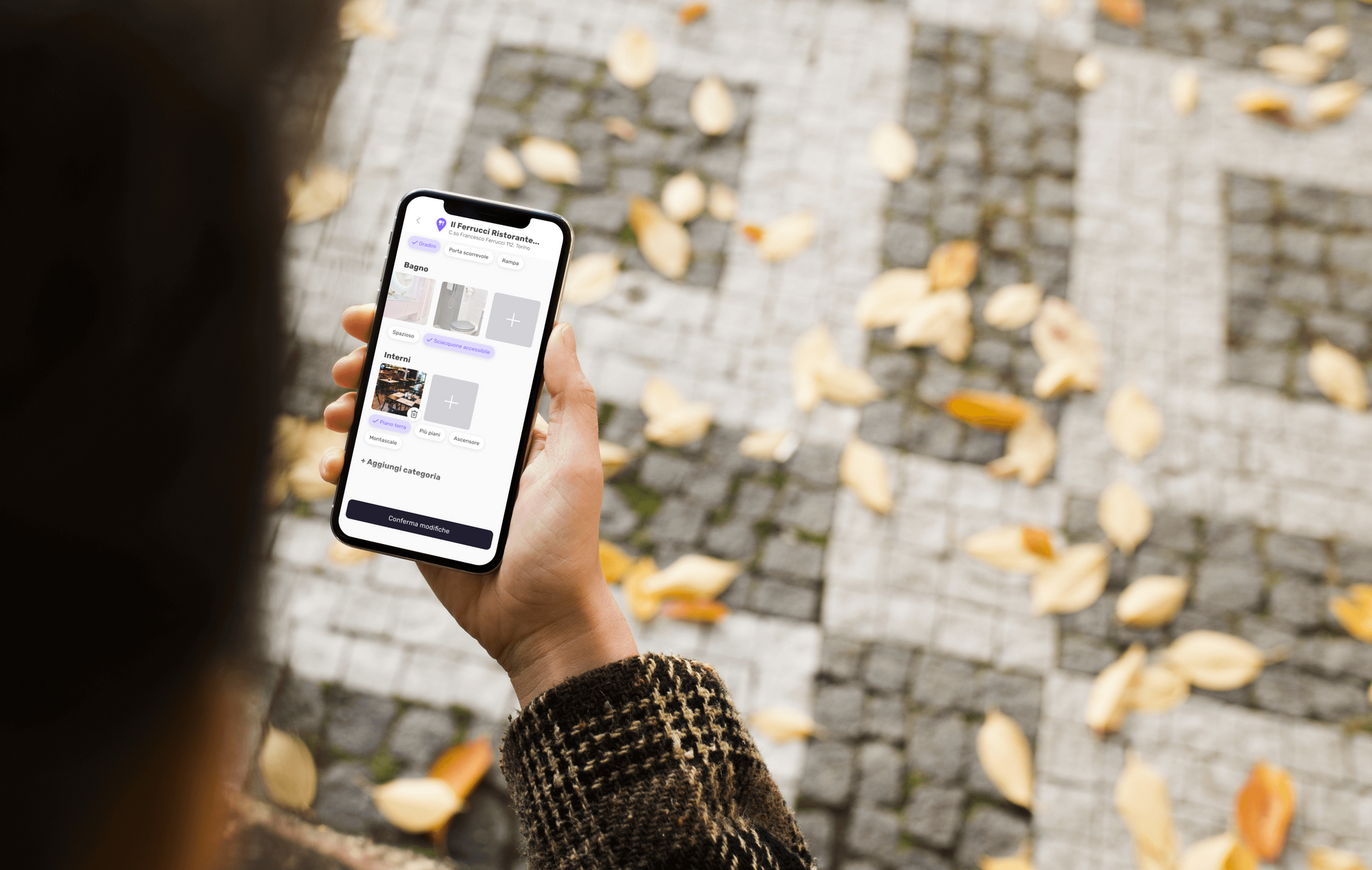
step-by-step guidance for reporting places & obstacles
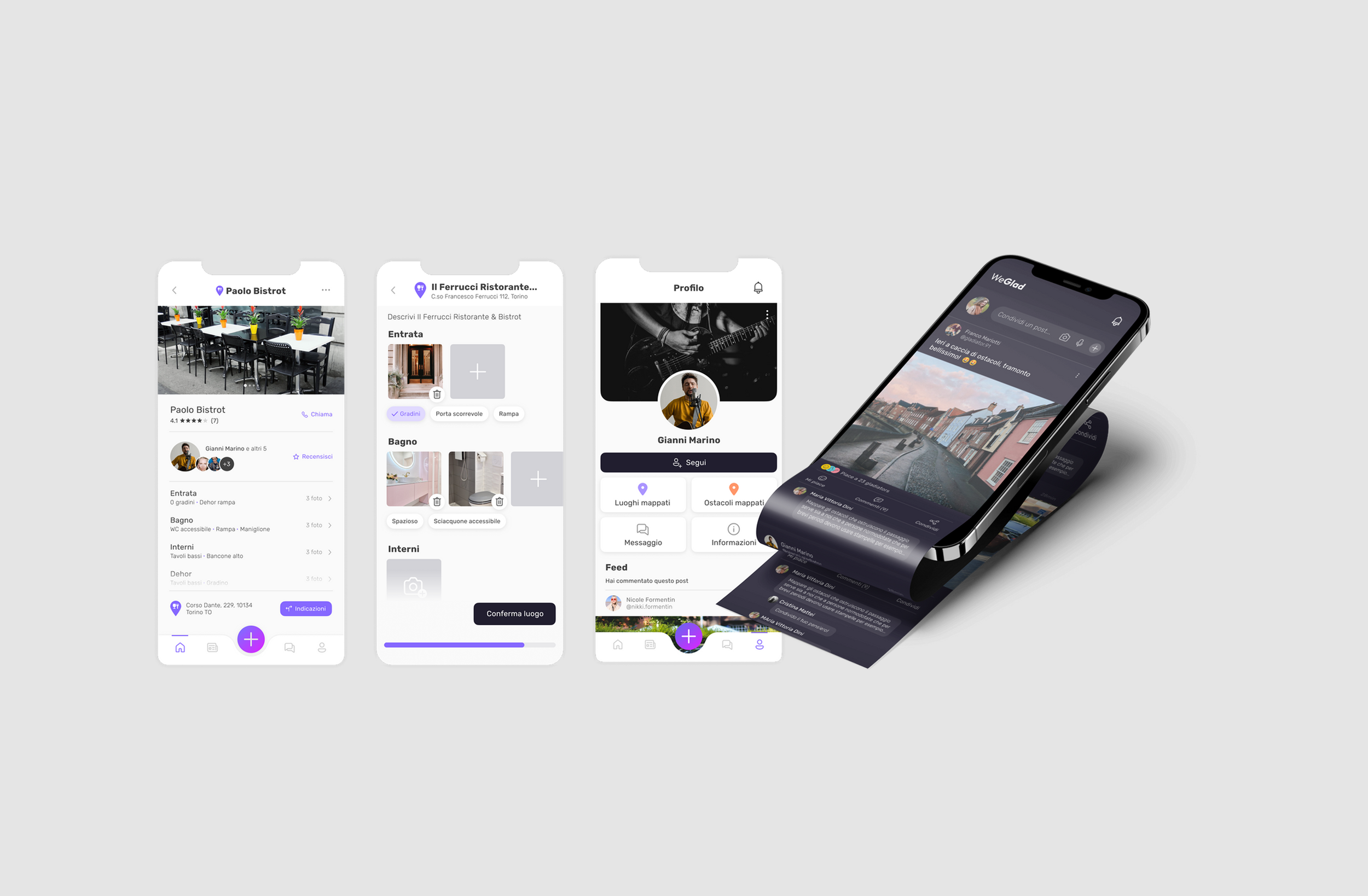
The flow for reporting places and obstacles was optimized to make it easier for users to contribute valuable information. Depending on the place or obstacle the user wants to map, a default set of information was prepared to help guiding the reporting flow. Categories, chips and taking pictures were designed to prevent errors and enable usability also for people with reduces mobility. This enhancement encourages user participation and helps maintain up-to-date and accurate data within the community.
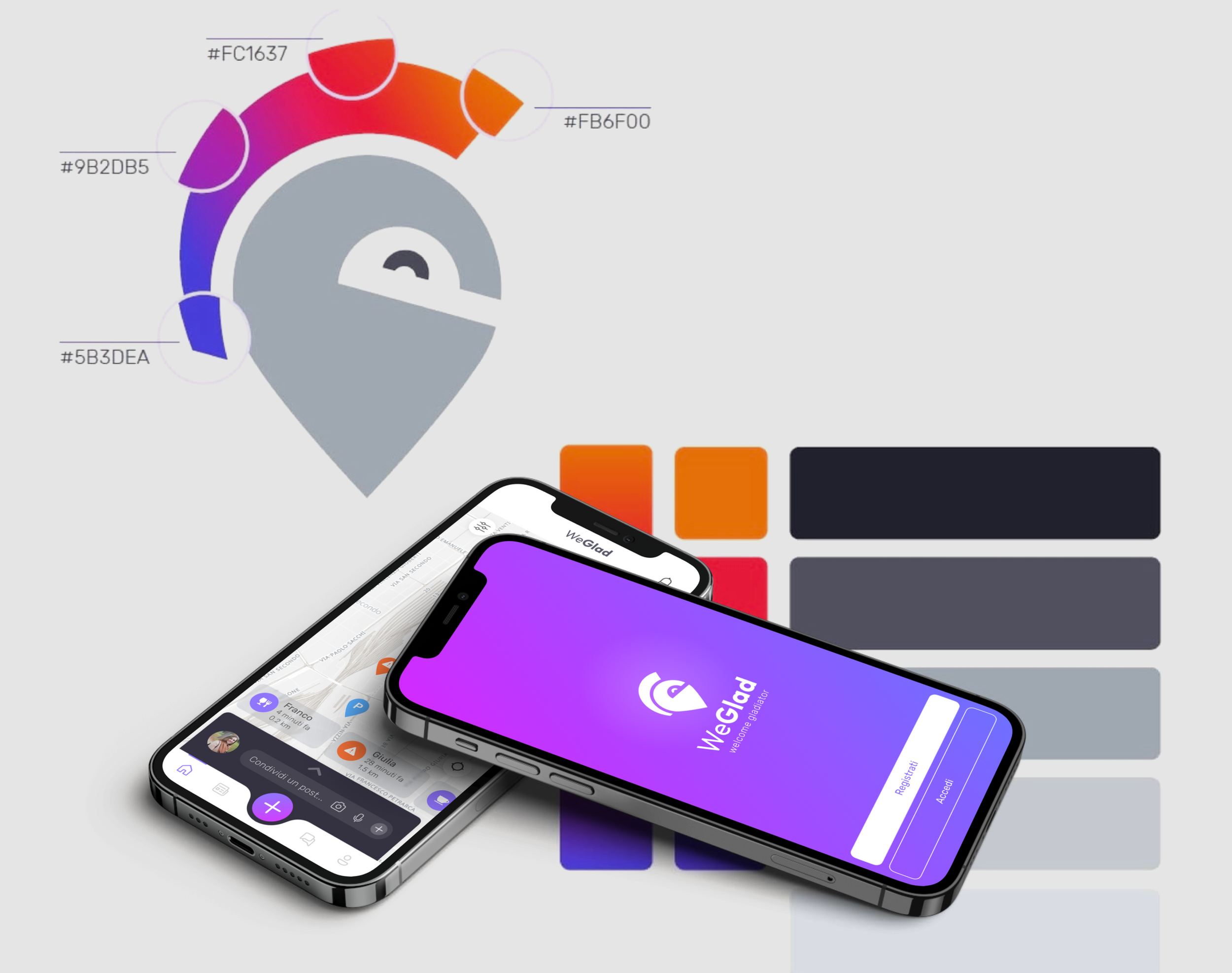
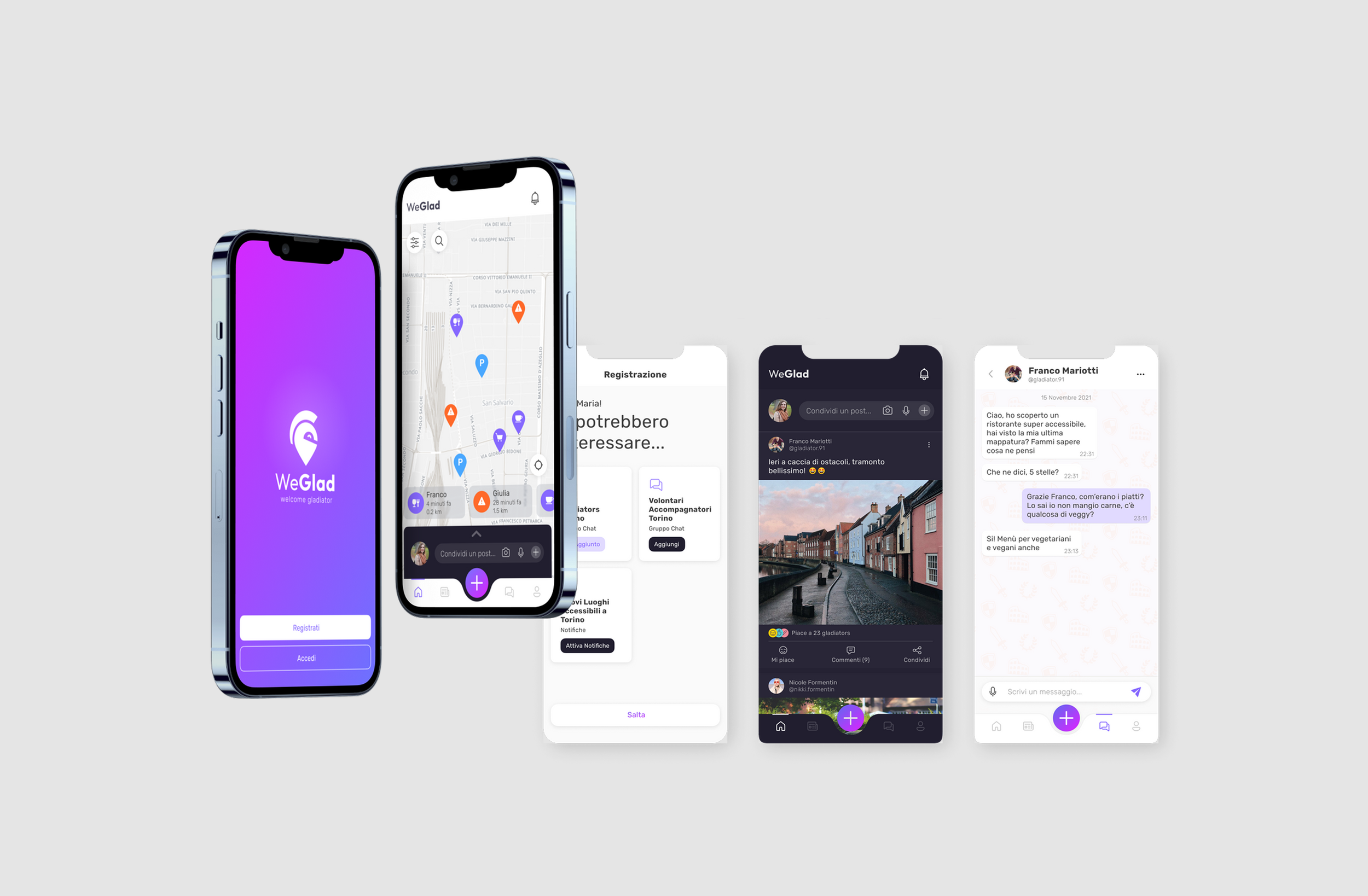
vibrant & colorful visual design for a memorable brand identity
The UI design was updated to reflect the new logo and branding, ensuring a cohesive and modern look throughout the app. This visual refresh enhances the overall user experience and aligns with the brand identity.