
USERTESTING
ParTicipant profile

(Intro)
One participant profile, designed to work wherever researchers need it.
Researchers needed an easier way to understand who was behind a session, who they were, why they qualified, and how they answered screening questions, without leaving their current workflow.
I led the design of a reusable participant profile that brings together identity, demographics, screener responses and contextual information in one lightweight experience. What started as a need on the Monitor page became a broader design challenge: how do we create one consistent profile that can adapt to different workflows without becoming a different experience in every touchpoint?
The work spanned information architecture, interaction design, accessibility and system thinking, establishing a flexible pattern that could scale from recruitment and monitoring into scheduling and other participant-focused workflows.
(Role)
END-TO-END PRODUCT DESIGN
(Product area)
PARTICIPANT MANAGEMENT
(Timeline)
2 MONTHS


PROCESS
From a single use case to a reusable platform pattern.
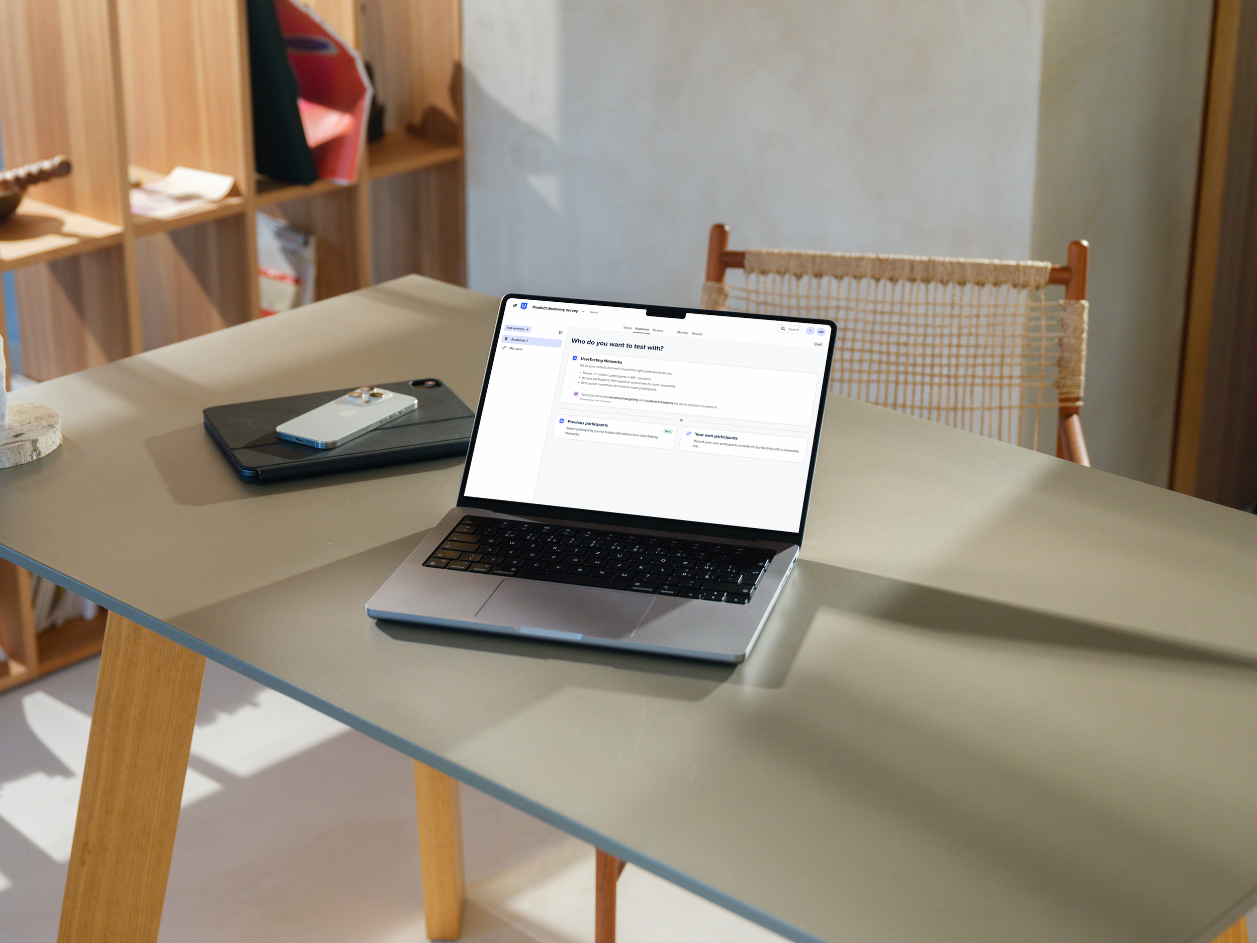
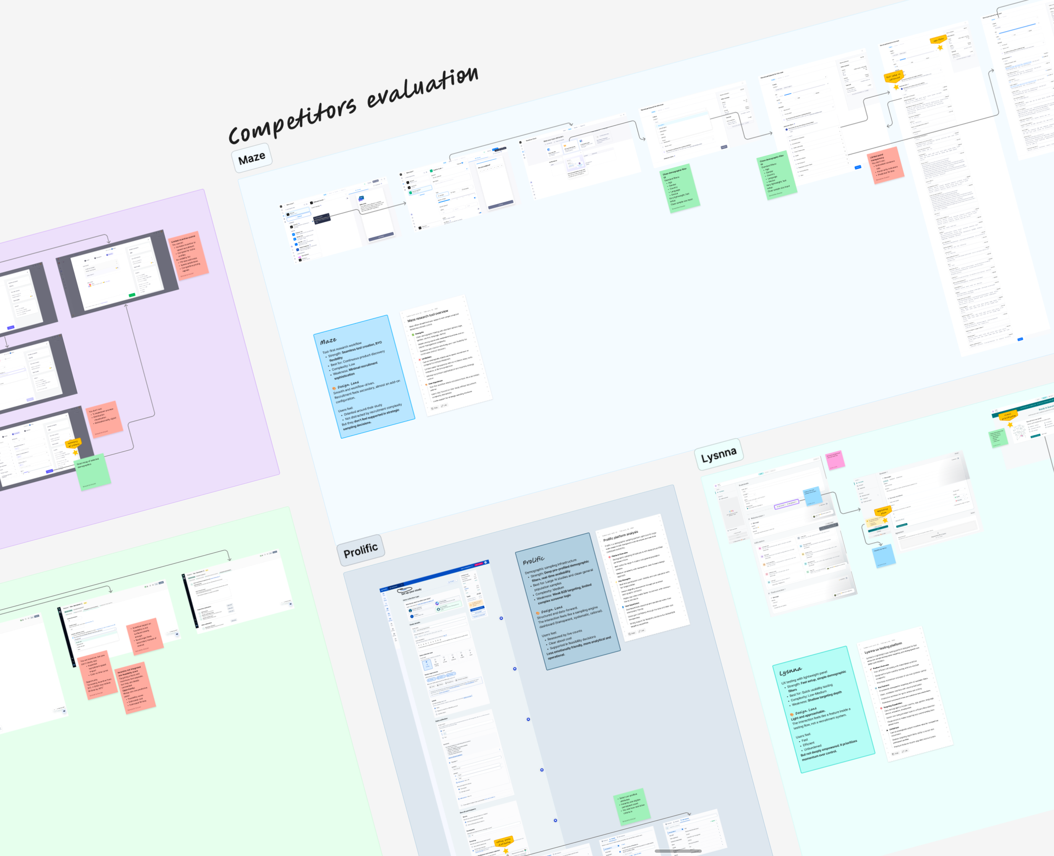
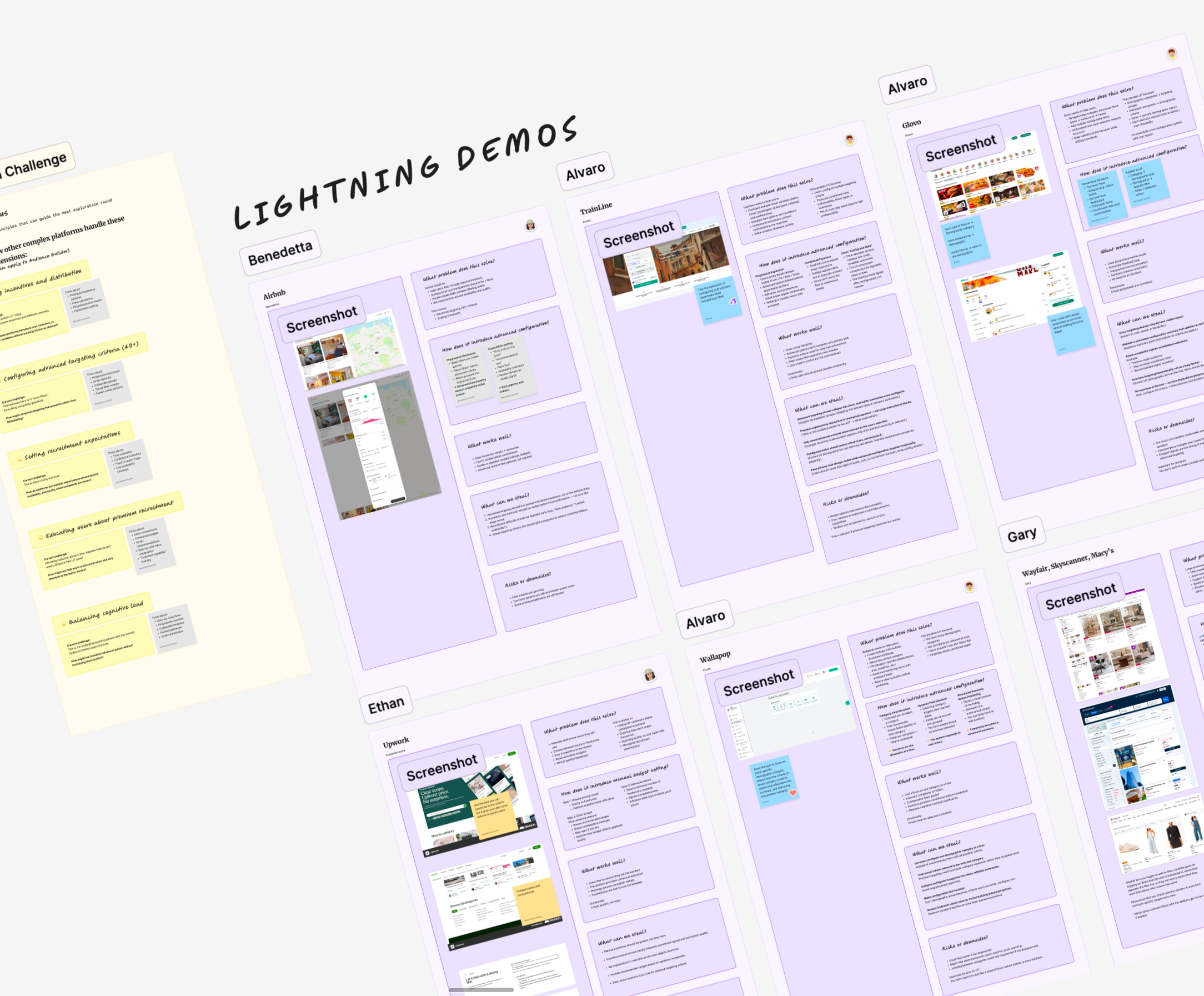
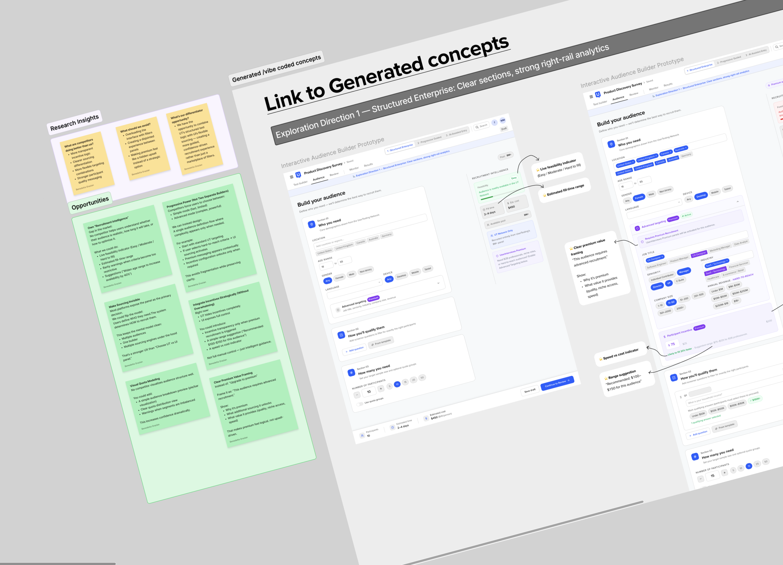
Because the profile would appear across different areas of the platform, alignment was key from the start. I facilitated cross-functional workshops with designers, PMs and teams owning different touchpoints to uncover their needs, map shared and context-specific information, and align on a common direction.
From there, I defined the information architecture and interaction model, then stress-tested the pattern across different contexts, data states and accessibility requirements—creating a flexible foundation that could scale across the platform.
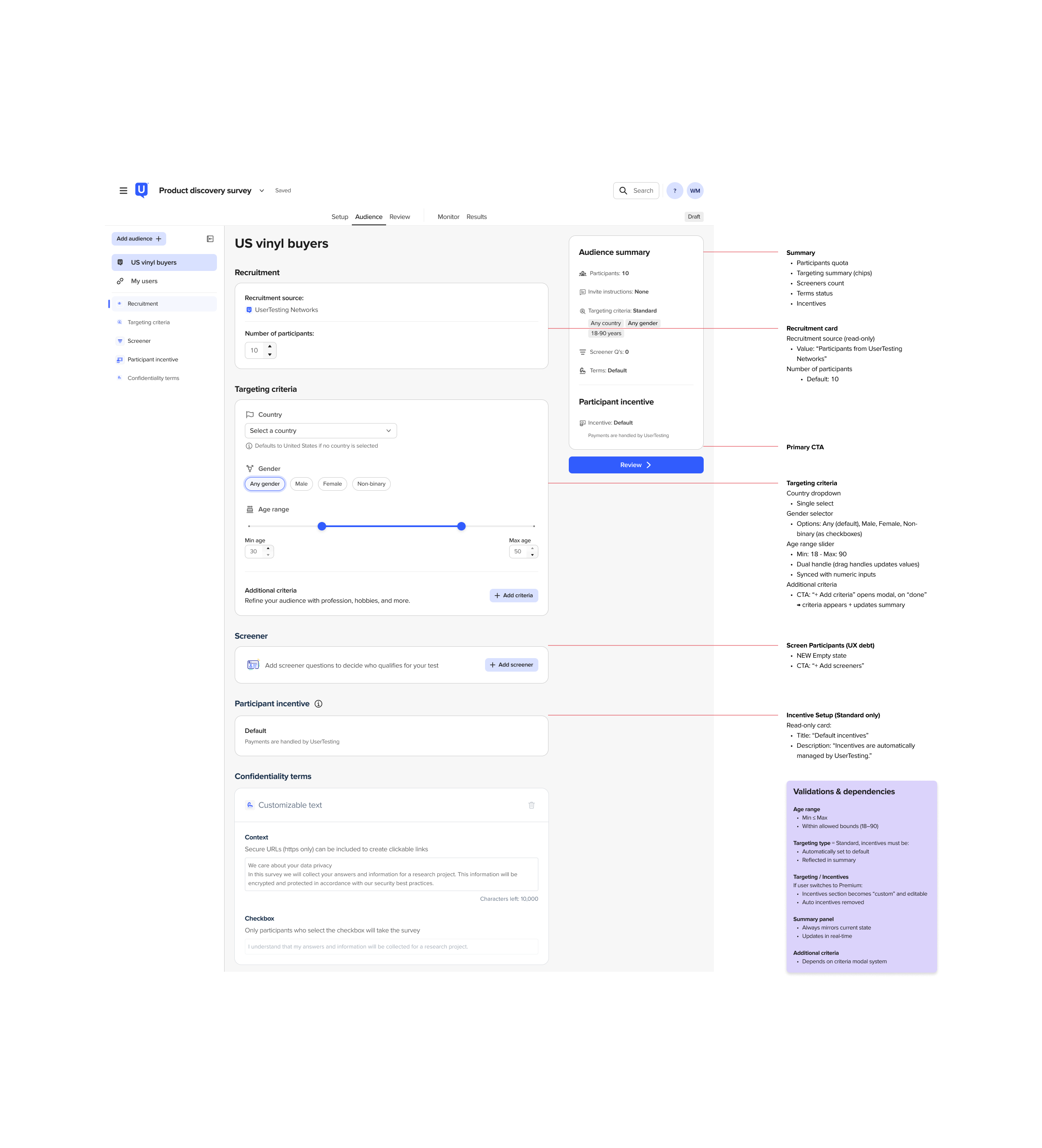
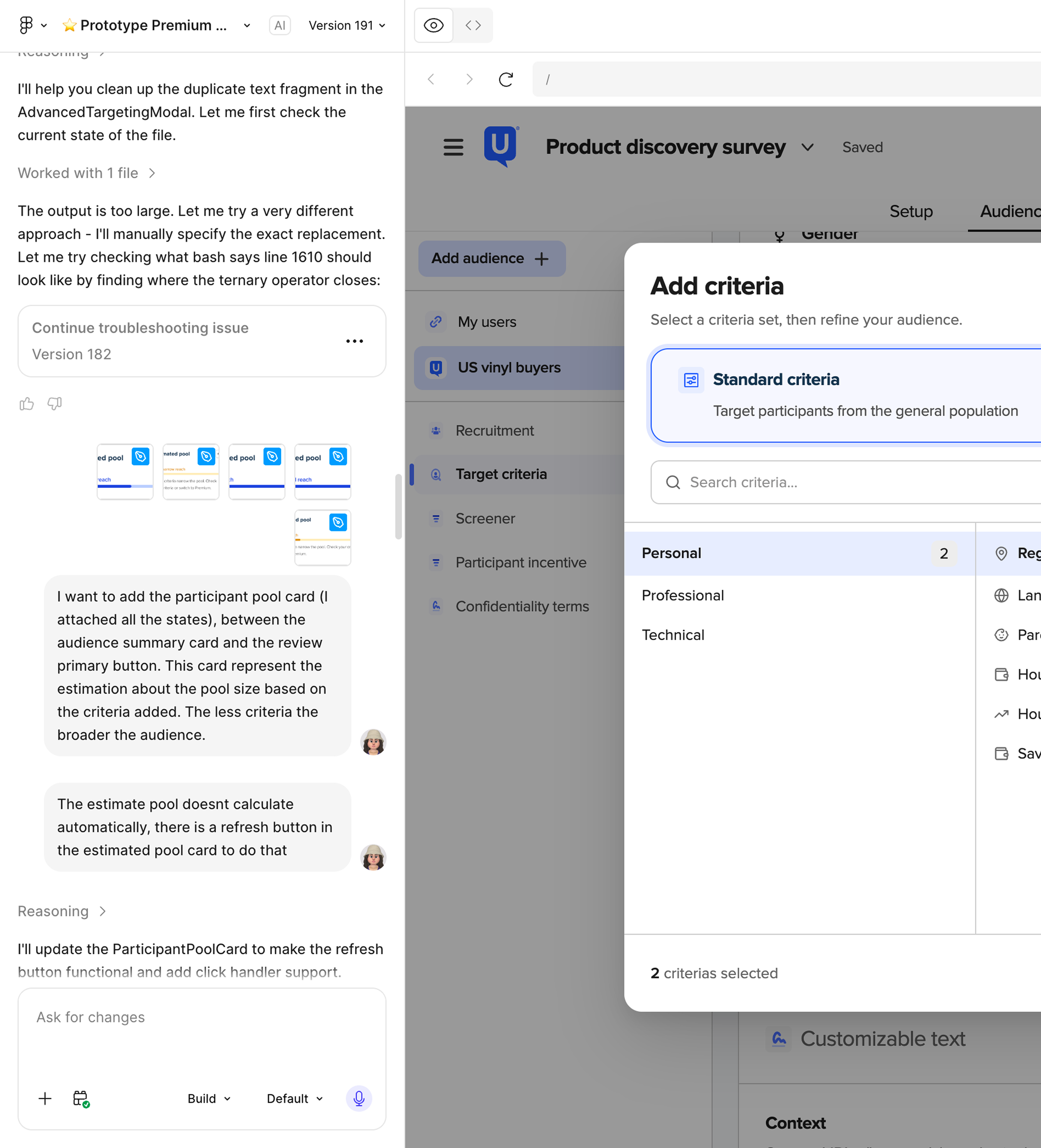
solution
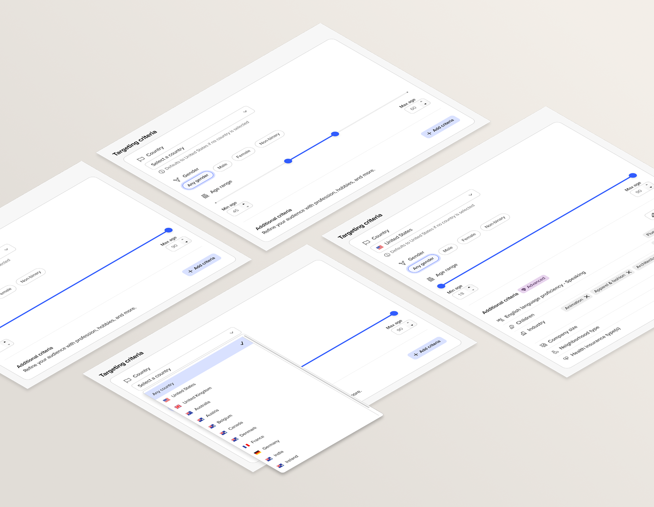
progressive disclosure
Participant profiles can contain a significant amount of information, but most interactions only require a quick check. Progressive disclosure balanced both needs: essential details remain immediately visible, while participant IDs, additional information, demographics, and screener responses can be explored when needed. This kept the profile lightweight without sacrificing depth.
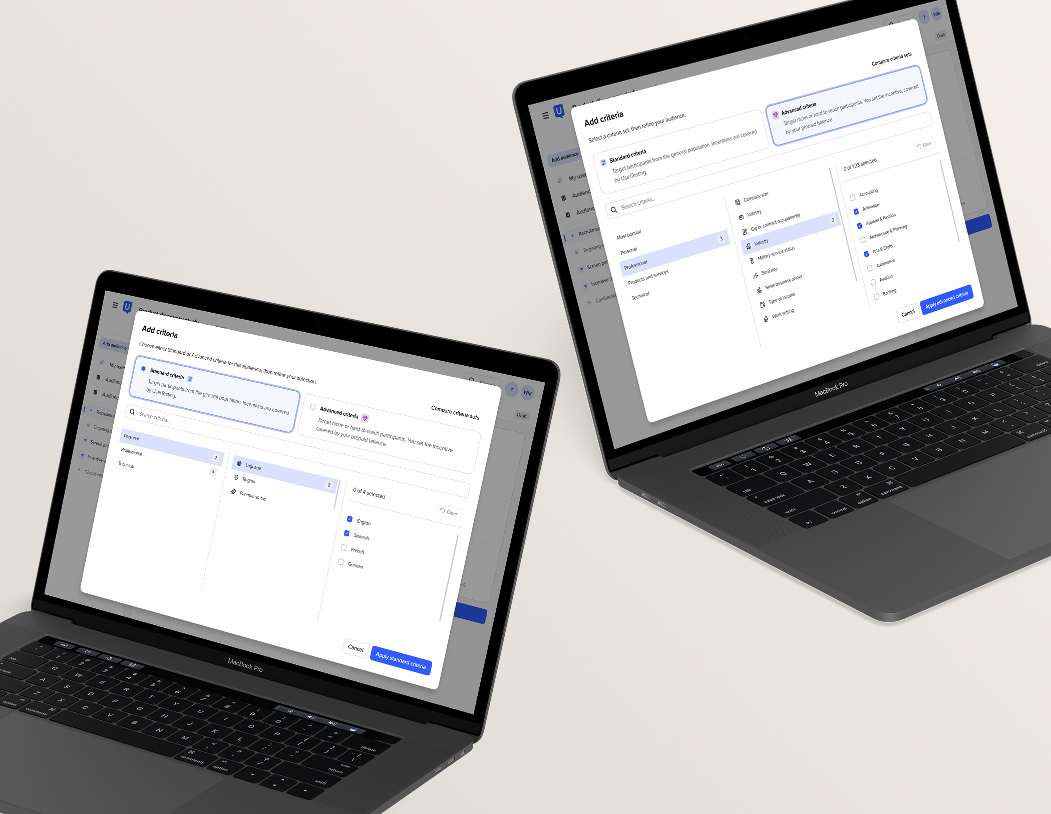
designing around researcher intent
The same information does not have the same importance in every context. Rather than defining a fixed hierarchy for the entire platform, content was prioritized around the researcher’s task. On Monitor, for example, screener responses come first because understanding why someone qualified is often more valuable than reviewing their full demographics. When that data is unavailable, the experience gracefully surfaces the next most relevant content.
solid information architecture
The first challenge was defining what makes a participant recognizable across the platform. The profile was structured around three layers: core identity, research context, and touchpoint-specific information. This established a shared foundation that teams could build on, while leaving enough flexibility for each workflow to surface what matters most.
designing for imperfect data
Participant data varies depending on source, recruitment method, and study setup, so the ideal state could not be the only state considered. The main data combinations were mapped and translated into clear rules for missing demographics, unavailable screener responses, branching logic, and different participant sources. Treating these scenarios as part of the architecture made the pattern more resilient and scalable.
PROVING THE PATTERN COULD SCALE
Scheduler became the first real stress test of the architecture. Researchers still needed the same identity, demographics, and screener context, but the workflow introduced an entirely new layer: session information and states.
Rather than creating a Scheduler-specific profile, the existing structure expanded with a contextual Session details tab. The core remained unchanged while the content adapted, validating the model we had established from the start: a stable foundation with context-specific modules.
Designing the behavior, not just the UI
For a pattern used across the platform, consistency needed to extend beyond its visual design. Shared rules were defined for scrolling, responsive behavior, tab logic, empty states, focus management, keyboard navigation, and screen-reader structure. Accessibility was considered alongside the interaction model from the start, helping create a component that behaves predictably wherever it appears.
impact
CUSTOMER VALUE
IN CONTEXT
INFOrmation
Researchers can validate participant fit, demographics, and screener responses without leaving their current workflow.
CONSISTENCY
1 SHARED
PROFILE PATTERN
A recognizable information architecture and interaction model across different product touchpoints.
SCALABILITY
WORKFLOWS
The same foundation expanded from Monitor into Scheduler and future participant-focused experiences without reinventing the core pattern.
MULTIPLE
DESIGN LEADERSHIP FEEDBACK
“THIS IS BEAUTIFUL!
HAVE YOU EVER HEARD OF OBJECT-ORIENTED UX?
IT’S PRETTY MUCH WHAT YOU’VE DONE HER.”

Chloe Sanderson - Design Manager